Health & Wellness · Design · 2026
Wellness Hub Conversion Funnel
A high-converting, responsive funnel website for a yoga community, with a clean, "breathable" UI that guides visitors from landing to sign-up.
- Figma
Overview
The Wellness Hub Conversion Funnel is a responsive funnel website for a yoga community that offers live classes, on-demand video lessons and in-person practice. We designed the full journey, from the first landing screen through to plan selection and account creation.
Our scope covered UI/UX design, conversion funnel design and responsive web design. The core brief was to build a clean, "breathable" UI that balances content-heavy schedules with a calming aesthetic and guides visitors from landing to sign-up.
The challenge
The client wanted a platform that felt more personal than a standard website. Its main business goal was to turn casual visitors into active community members.
The difficulty was volume. A yoga community has a lot to show: weekly schedules, teachers, class types and intensities, feature lists, video previews and membership options. Put all of that on one page and it overwhelms, which works against the calm that brings people to yoga. Every section had to inform without crowding and move the visitor closer to signing up.
Goals
- Turn casual visitors into active community members.
- Present schedules, features and video content without overwhelming users.
- Establish immediate credibility and calm through the visual design.
- Keep the conversion point within reach throughout the journey.
- Make the complex weekly schedule work as well on mobile as on desktop.
Our approach
We designed the site as a tiered funnel, where each section has one job and hands the visitor on to the next. The hero builds interest, the benefits section builds desire, the schedule and video lessons build confidence, and the membership page closes. Three pillars shaped the work:
- Visual trust. A palette of "Mindful Teal" and soft neutrals creates immediate credibility and calm. Generous white space keeps dense content breathable.
- Feature-led navigation. Instead of relying on traditional menus to explain the offer, we used feature blocks that highlight "What You'll Gain", which puts the value proposition at the centre of the page.
- Cross-platform consistency. A "Dual-Device" strategy meant designing the hardest component, the Weekly Schedule, for desktop and mobile side by side, rather than adapting it later.
Throughout, "Start Your Journey" is the single primary action. It follows the user through the scroll in the header, in section banners and at the end of key modules, so the conversion point is always one click away.
What we built
Landing hero
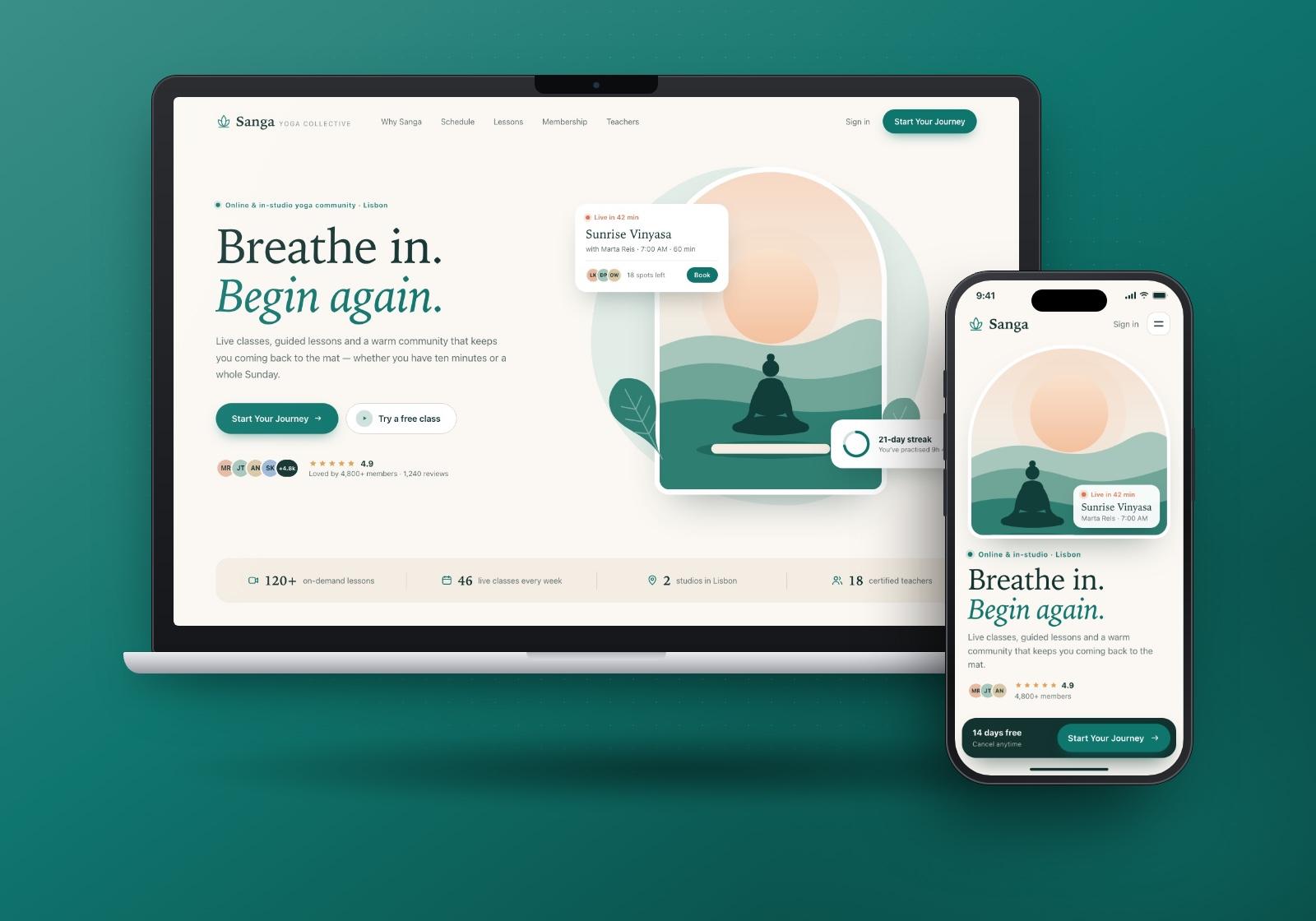
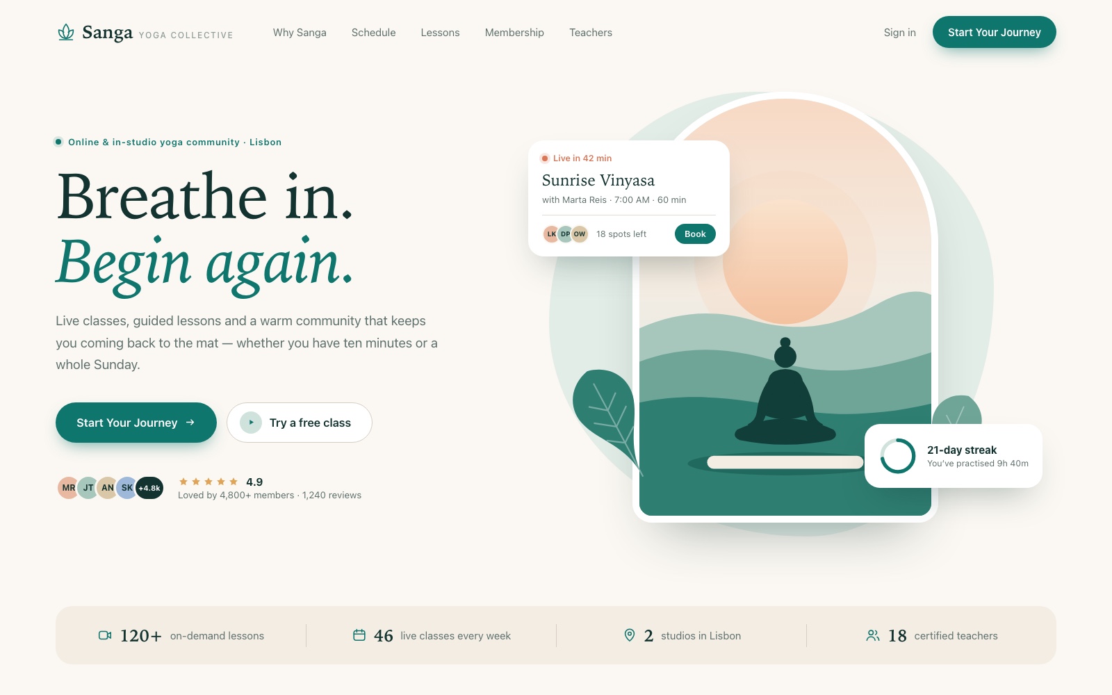
The hero opens with a short, calming headline and one sentence on what the community offers. "Start Your Journey" is the primary button, with "Try a free class" as a lower-commitment alternative. The illustration on the right is soft and warm, with floating cards for an upcoming live class and a practice streak hinting at the product. A strip of key facts across the bottom answers "how much is there?" before the visitor scrolls.
"What You'll Gain"
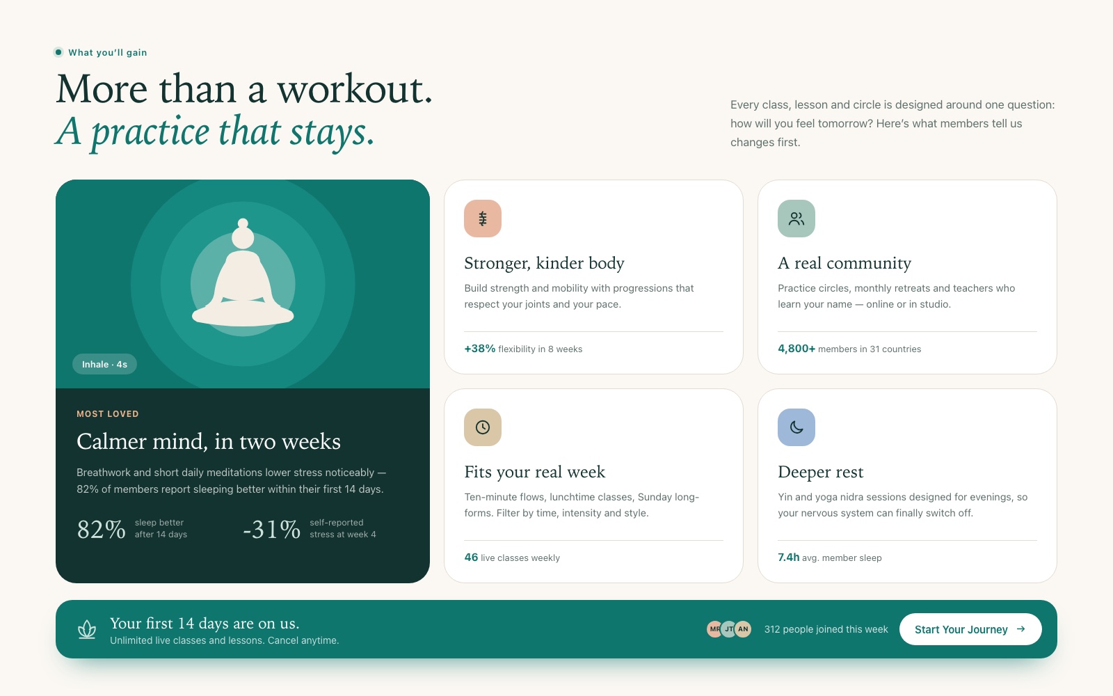
Rather than listing features, this section frames the offer as outcomes. One large highlighted card leads, and four smaller feature blocks around it cover body, community, schedule flexibility and rest. Each block has an icon, a short benefit statement and a supporting detail line. A full-width teal banner closes the section with a trial offer and the "Start Your Journey" button.
Interactive weekly schedule
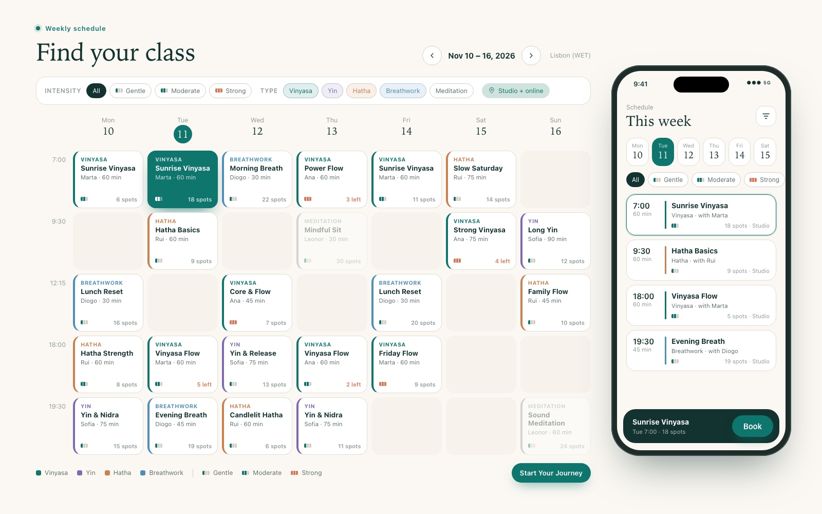
The schedule was the hardest content to design. We built a custom grid of class cards, one column per day and one row per time slot. Each card shows class type, name, teacher, duration and spots left. Users filter by intensity (gentle, moderate, strong) and type (such as vinyasa, yin, hatha, breathwork and meditation). Colour-coded type labels and a three-bar intensity indicator make the grid scannable. On mobile, the same data becomes a day picker and a vertical list, with a sticky booking bar at the bottom.
Video lessons
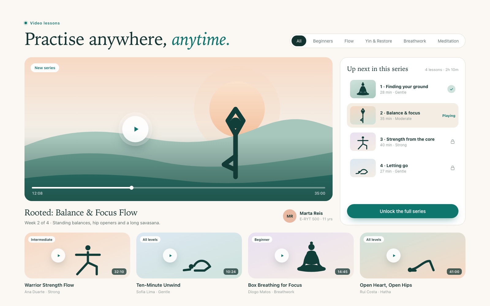
Embedded video previews of pre-recorded lessons give visitors a taste of the teaching and increase time on page. A featured player with a progress bar sits next to an "Up next in this series" list. Later lessons show a lock icon and an "Unlock the full series" button, which links the content to the membership offer. Below, preview cards with play overlays, level tags and durations invite browsing by category.
Sign-up and membership
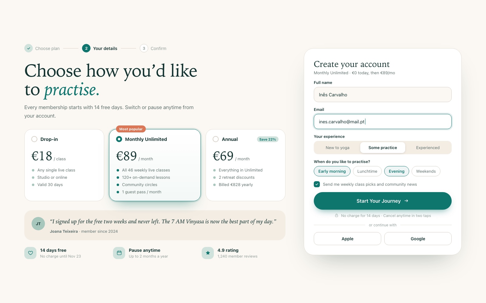
The final step pairs plan choice with a short form on one screen. A three-step progress indicator shows how close the user is to finishing. Plan cards compare drop-in, monthly and annual options, with the most popular plan highlighted. The account form asks only for essentials and a couple of quick preference choices. Reassurance sits right beside the decision: a member quote, a free-trial note and pause and cancellation terms.
Design system
Palette. The system uses mindful teal #0F766E for primary actions and key highlights, soft sage #CFE3DC for supporting surfaces and illustration, and warm sand #F4EDE4 for backgrounds. A gentle peach accent appears in illustrations and for urgency cues such as low availability. Class types each have their own muted colour so the schedule stays readable without looking loud.
Typography. An elegant serif is used for headlines, with italic teal for emphasis phrases that give the brand a warm, human voice. Body text, labels and schedule data use a clean sans-serif sized for comfortable reading. Small labels mark section names and class types.
Components. Rounded filled and outlined buttons, benefit cards, schedule cards with type stripe and intensity bars, filter chips, video preview cards, selectable plan cards, form inputs and a step indicator.
Motion and visual language. The visual language is soft and rounded: generous corner radii, flat illustrations of rolling hills and sunrise, gentle shadows and plenty of white space. Emphasis comes from colour and scale, never from heavy effects, which keeps the experience calm.
Responsive strategy. Under the "Dual-Device" approach, the schedule was designed for both screen sizes from the start. Multi-column sections stack into single columns on mobile, and "Start Your Journey" stays within reach on every screen.
Results
The result is a polished, professional funnel that positions the brand as a premium wellness leader. The layout is optimized for engagement, with a clean visual hierarchy that leads the eye to the main conversion goals.
Schedules, feature lists and video previews sit inside a calming, breathable design that informs without overwhelming, and every section moves visitors one step closer to joining, on desktop and mobile.