DeFi & Fintech · Design · 2026
Olympia DeFi Ecosystem
A premium financial dashboard and landing page for a DeFi protocol, blending Grecian-inspired motifs with modern Web3 data visualization for a "Luxury DeFi" feel.
- Figma
Overview
The Olympia DeFi Ecosystem is a decentralized finance protocol for staking, trading and earning yield. We designed a premium, high-fidelity landing page and financial dashboard for it, plus a mobile portfolio experience. Classical Grecian-inspired motifs are combined with modern Web3 data visualization to create what we called a "Luxury DeFi" experience.
Our scope covered UI/UX design for the landing page, the trading dashboard and the mobile app. Every surface had to emphasize three things: stability, transparency and high-yield rewards.
The challenge
Web3 and DeFi are full of interfaces that look either overly technical or generically "tech": neon grids, cyberpunk gradients and interchangeable dashboards. To stand out, the protocol needed a brand identity that felt established, wealthy and secure, the opposite of a weekend experiment.
The difficulty was that the identity couldn't come at the cost of function. The UI had to handle complex data, including tokenomics, a multi-phase roadmap and live market charts, while keeping a cohesive, regal look. Professional traders need dense, accurate information, and ornamental design can easily get in the way of that.
Goals
- Create a distinctive brand identity that signals establishment, wealth and security.
- Turn abstract financial concepts such as supply, distribution and vesting into easy visual stories.
- Give professional traders a full analytics view without losing the luxury feel.
- Keep the brand intact on mobile while making portfolio management one-thumb simple.
- Connect the product to its community in a way that matches the visual identity.
Our approach
We named the direction "Golden Era" fintech. The system is built on two values, prestige and performance, and each design decision had to serve both.
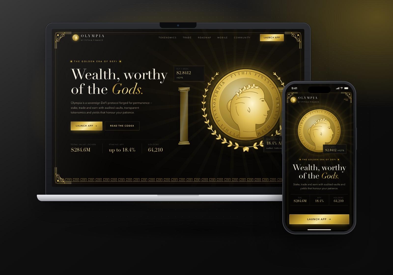
- Thematic branding. Gold-leaf textures, ornate filigree corners, Greek key borders, columns and laurel-wreathed coin art evoke the Olympian theme. These details sit at the edges and in hero moments, never inside data tables.
- Complex data, simple stories. Custom tokenomics modules and a linear roadmap translate financial mechanics into visuals people can follow. The protocol's mythology becomes a narrative device, with roadmap phases named as ages.
- High-fidelity dashboarding. The analytics interface is dark-mode first, with gold-accented charts on obsidian. Ornament steps back there so data can lead.
What we built
Landing hero
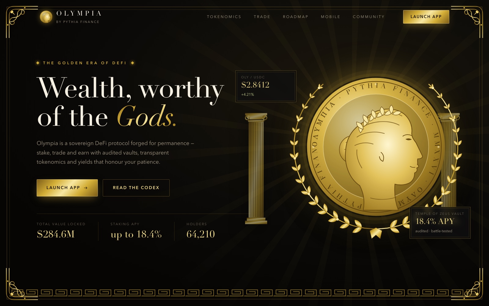
The hero is framed by gold filigree corners and a Greek key border, with a large laurel-wreathed coin flanked by classical columns. A serif headline with an italic gold accent sets the tone, and "Launch App" is the primary action, repeated in the header. Small floating panels for the token price and a featured vault's yield bring live data into the hero without breaking the composition.
Tokenomics: Total Supply
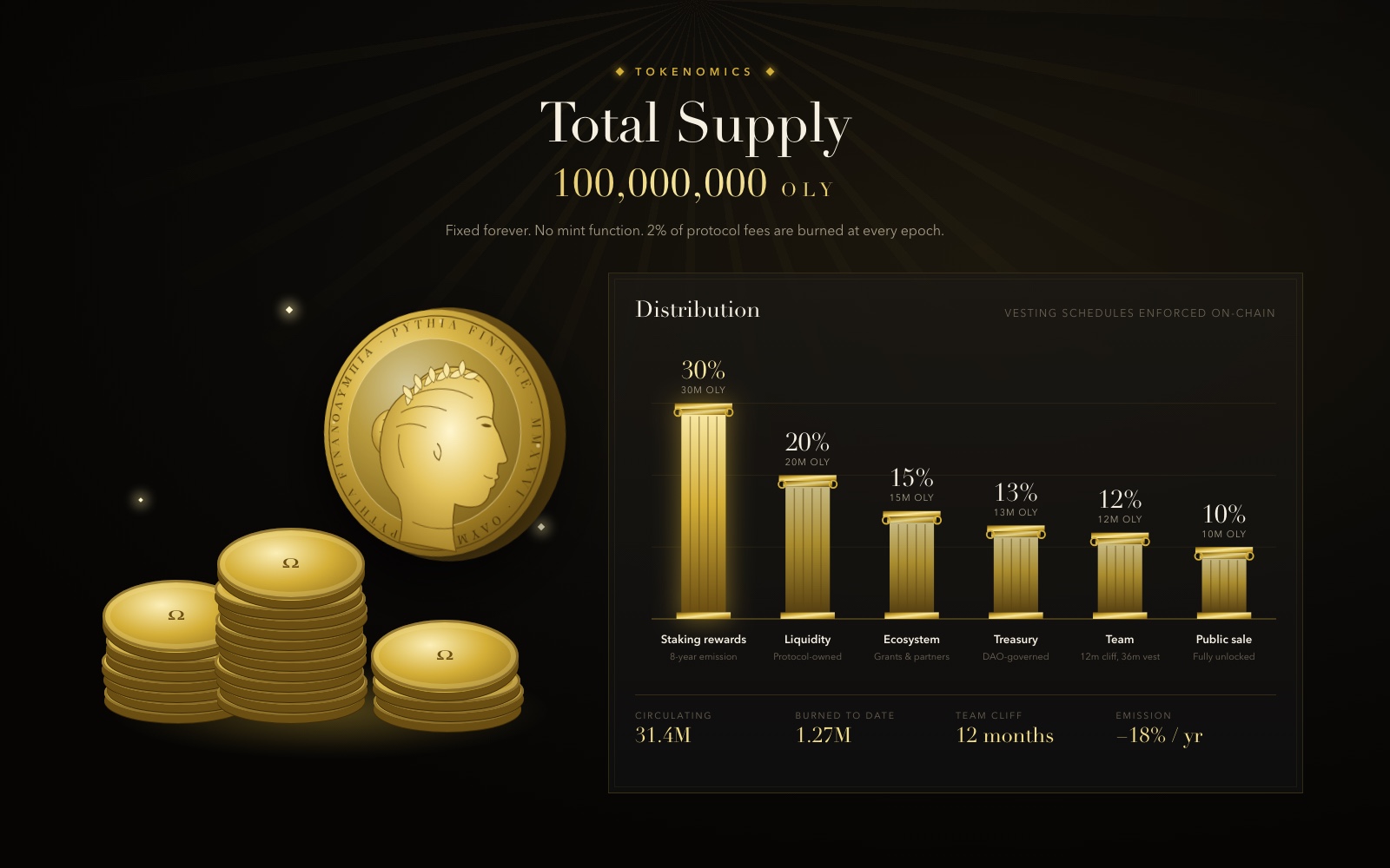
The "Total Supply" section pairs custom-illustrated 3D coin stacks with a distribution chart where each bar is drawn as a fluted gold column. Each bar shows its percentage, token amount and a short note on vesting or governance. A row of key figures underneath covers circulating supply, tokens burned, team cliff and emission.
Trading dashboard
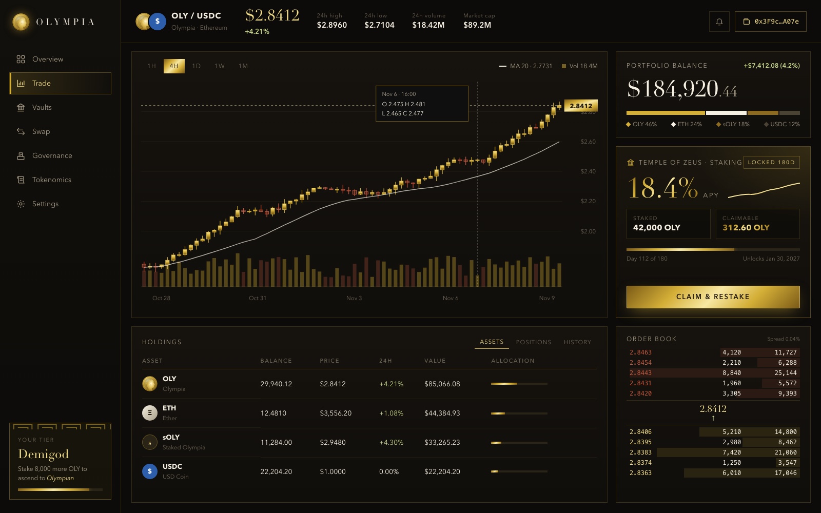
The dashboard is where the luxury theme meets professional tooling. A gold candlestick chart with timeframe controls, a moving average and volume bars takes centre stage. Around it sit a portfolio balance card with allocation breakdown, a staking card showing yield and lock progress, a holdings table and an order book. Ornament is kept to the sidebar's tier card, so the data area stays clean, and "Claim & Restake" is the one high-emphasis action on the screen.
Roadmap timeline
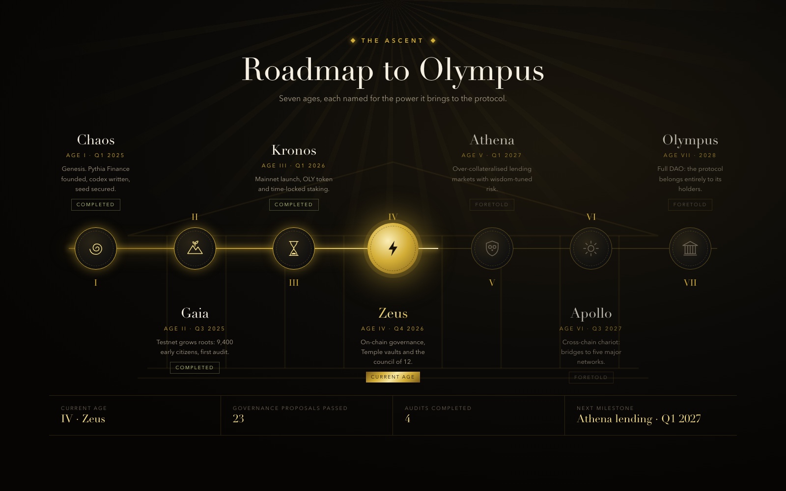
The roadmap is a horizontal journey map with glowing nodes. Each milestone is named as an "age" and given its own mythological icon, laid over a faint temple outline. Completed ages are gold, the current age glows brightest and is labelled, and future phases are dimmed as "foretold". A summary bar beneath lists the current age and the next milestone.
Mobile portfolio
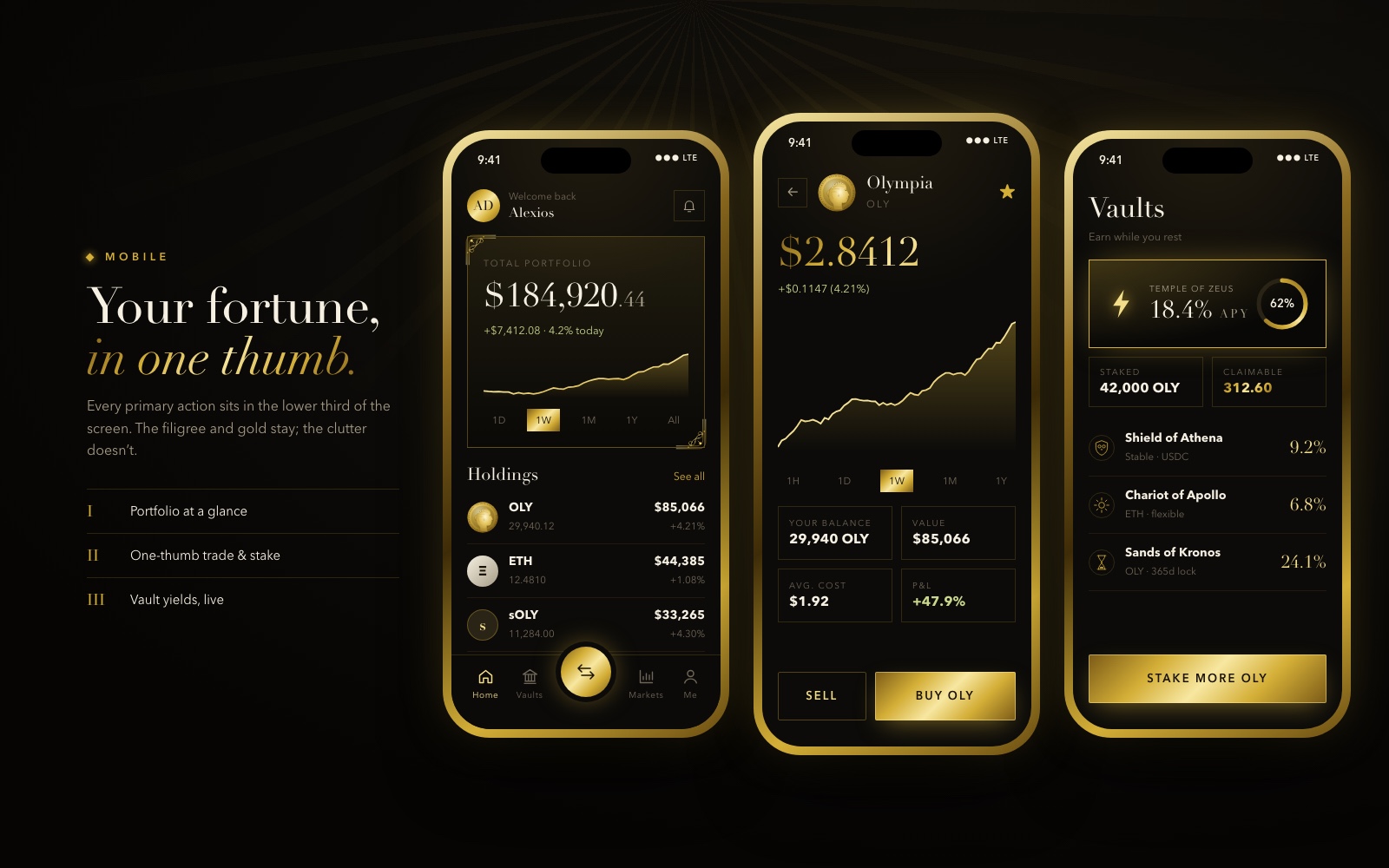
On mobile we kept the filigree and gold but stripped out everything else. Every primary action sits in the lower third of the screen for one-thumb navigation. The home screen shows portfolio value, a performance chart and a holdings list, with a central swap button in the tab bar. The token detail screen puts buy and sell side by side, and the vaults screen lists staking options with yields and a single "Stake more" action.
Community and footer
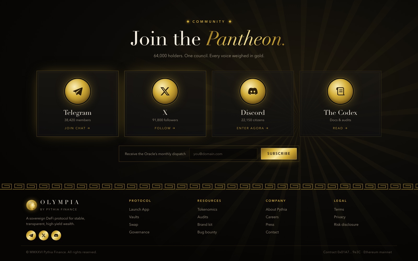
The community section brings social proof into the same visual system. Channels including Telegram and X get custom gold coin icons rather than standard logos, so they sit in harmony with the rest of the page. A newsletter sign-up and a Greek key border lead into a structured footer that repeats the gold social icons.
Design system
Palette. The system uses three core colours: obsidian #0F0F0F for backgrounds, gold #D4AF37 for accents, data and actions, and ivory #F5F0E1 for headings and body text. Gold appears as flat fills on buttons and as metallic gradients on illustrations, which gives depth without adding new hues.
Typography. A high-contrast serif carries headlines and large figures, with italic gold for emphasis words. Widely tracked uppercase labels handle navigation, section eyebrows and table headers. Dense data uses a clean sans-serif for legibility at small sizes.
Components. Filigree corners, Greek key dividers, outlined and gold-filled buttons, gold-bordered data cards, gold-column bar charts, candlestick and area charts, medallion roadmap nodes and coin-style social icons. Components come in decorative and data-dense variants, so the same parts serve the landing page and the dashboard.
Motion and visual language. Soft radial light rays and glows signal importance: the hero coin, the current roadmap age and the primary buttons. Mythology works as the naming and illustration system across phases, vaults and tiers, which gives the product a consistent story.
Responsive strategy. Desktop modules collapse into focused mobile screens, one task per screen. Gold-framed devices and filigree survive at every size, but data tables become simple lists and primary actions move to the bottom of the screen.
Results
The design moves away from cyberpunk tropes toward a more sophisticated "Old Money" digital aesthetic. The funnel is more than a trading platform. It tells a story that builds investor trust through high-end design.
The protocol has an identity that feels established, wealthy and secure, and complex financial data stays readable inside a cohesive, regal system, from the landing page to the dashboard and the phone.