Web3 & Privacy · Design · 2026
dVPN Privacy Software Suite
A high-conversion landing page and multi-device interface for a decentralized VPN, with a security-first UI that makes subscriptions and the roadmap easy to follow.
- Figma
Overview
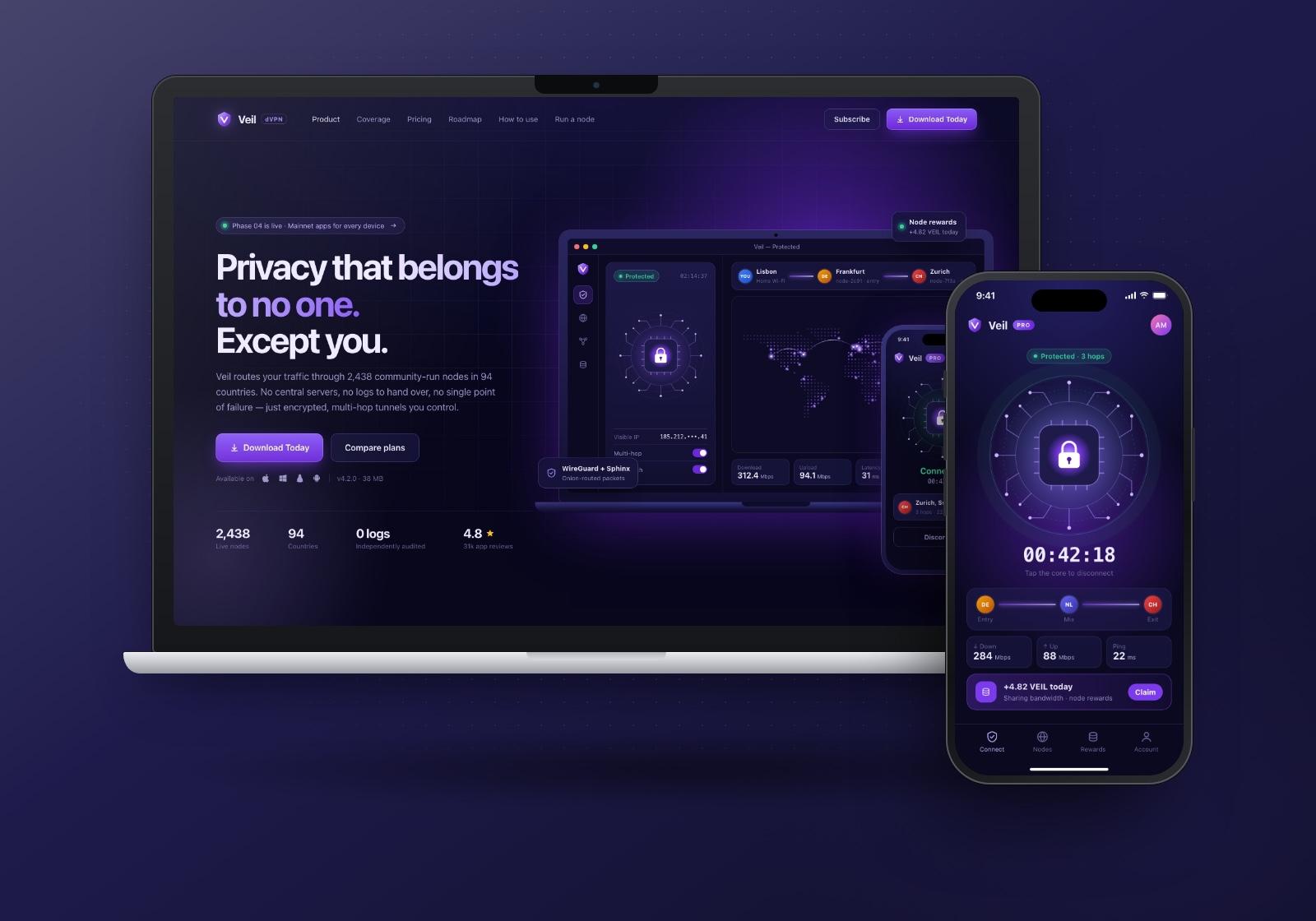
The dVPN Privacy Software Suite is a decentralized VPN service. Instead of sending traffic through servers owned by one company, it routes it through a network of independently run nodes. We designed the public face and the product interface for it: a high-conversion landing page, a desktop app view and a mobile app, all built on one security-first design system.
Our scope covered UI/UX design end to end. That included the information architecture of the landing page, the global coverage, pricing and roadmap modules, and the mobile "How to Use" flow. The aim was one visual language that reads as private and dependable on every device.
The challenge
The privacy software market is crowded, and much of it is technically overwhelming for general users. "Decentralized" brings in even more unfamiliar ideas: nodes, hops, tokens, on-chain verification. Most visitors arrive wanting one thing, which is to feel safe online, and they leave when the explanation gets in the way.
The audience is also split. Beginners need reassurance and a simple path to download, while privacy enthusiasts and investors want depth: how routing works, how big the network is and where it is heading. One page had to serve both, with a short path from learning to downloading.
Goals
- Make decentralized security approachable for beginners while staying credible to privacy enthusiasts.
- Create a frictionless path from first visit to download or subscription.
- Show the scale of the network at a glance.
- Make it quick and unambiguous to compare plans.
- Give investors and users a clear view of development progress from Phase 01 to Phase 07.
Our approach
We built the work around one principle we called "Discreet & Dependable". The interface should feel quiet and controlled, and every section should either add a security cue or remove a doubt. That meant visual clarity first, decoration second, and a strict hierarchy so the next action is always obvious.
Three decisions shaped the system:
- Night-mode privacy palette. Dark navy and royal purple set a tone of high-end digital security. Violet is reserved for interactive and "live" states.
- One visual metaphor for encryption. A circuit-core motif (a padlock inside rings of circuit traces) appears in the hero, the desktop app and the mobile app. Users learn the idea of layered protection once and recognize it everywhere.
- Conversion at every scroll depth. "Subscribe" and "Download Today" sit in the persistent header, and each major section ends close to a next step, so users never have to scroll back up to act.
What we built
Landing hero with multi-device mockup
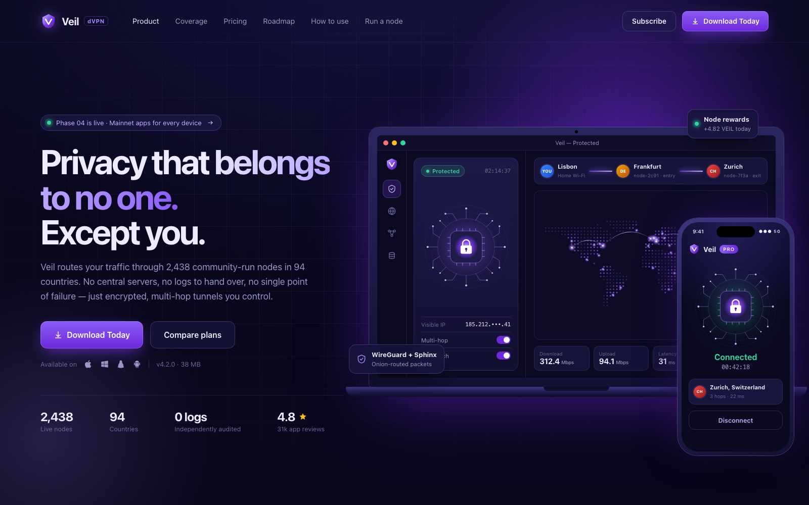
The hero opens with a short, confident headline and a plain-language explanation of community-run, multi-hop routing. "Download Today" is the primary button, and "Compare plans" is a secondary path for visitors who aren't ready yet. Synchronized laptop and phone mockups show the same protected session on both devices, so the multi-device story is visible before any copy explains it. Platform icons next to the CTA answer the "will it run on my machine?" question.
Global coverage map
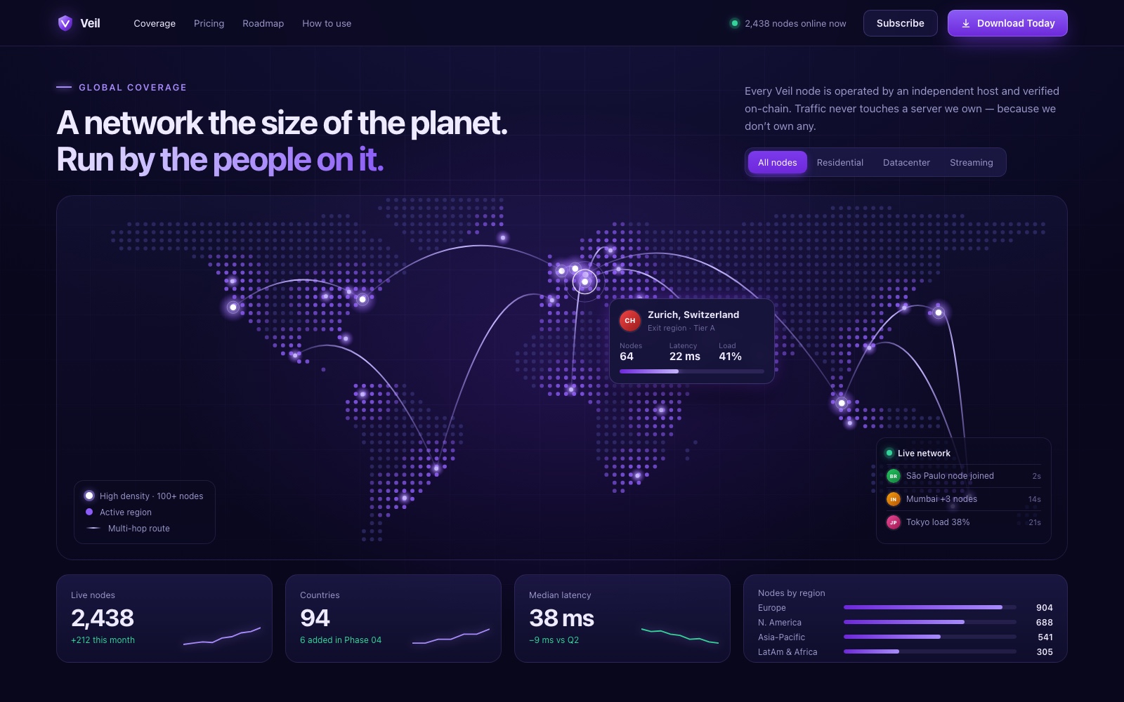
A stylized dot-matrix world map shows server nodes and multi-hop routes, so the scale of the network registers at a glance. Filter tabs (all nodes, residential, datacenter, streaming) let enthusiasts dig deeper. A region card shows node count, latency and load in a compact format. Summary cards below the map turn it into a few headline figures and a breakdown by region.
Tiered pricing with a "Best Deal" highlight
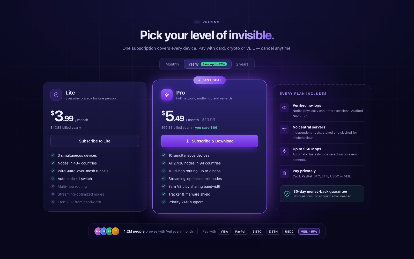
We designed the pricing module around a direct Lite vs Pro comparison. High-contrast cards, a "Best Deal" badge and a glowing border make Pro the clear recommendation without hiding Lite. Features that Lite doesn't include are greyed out rather than removed, so the difference is visible line by line. A third column lists what every plan includes, plus a money-back guarantee and payment options, which answers the last objections right next to the buttons.
Roadmap timeline, Phase 01 to Phase 07
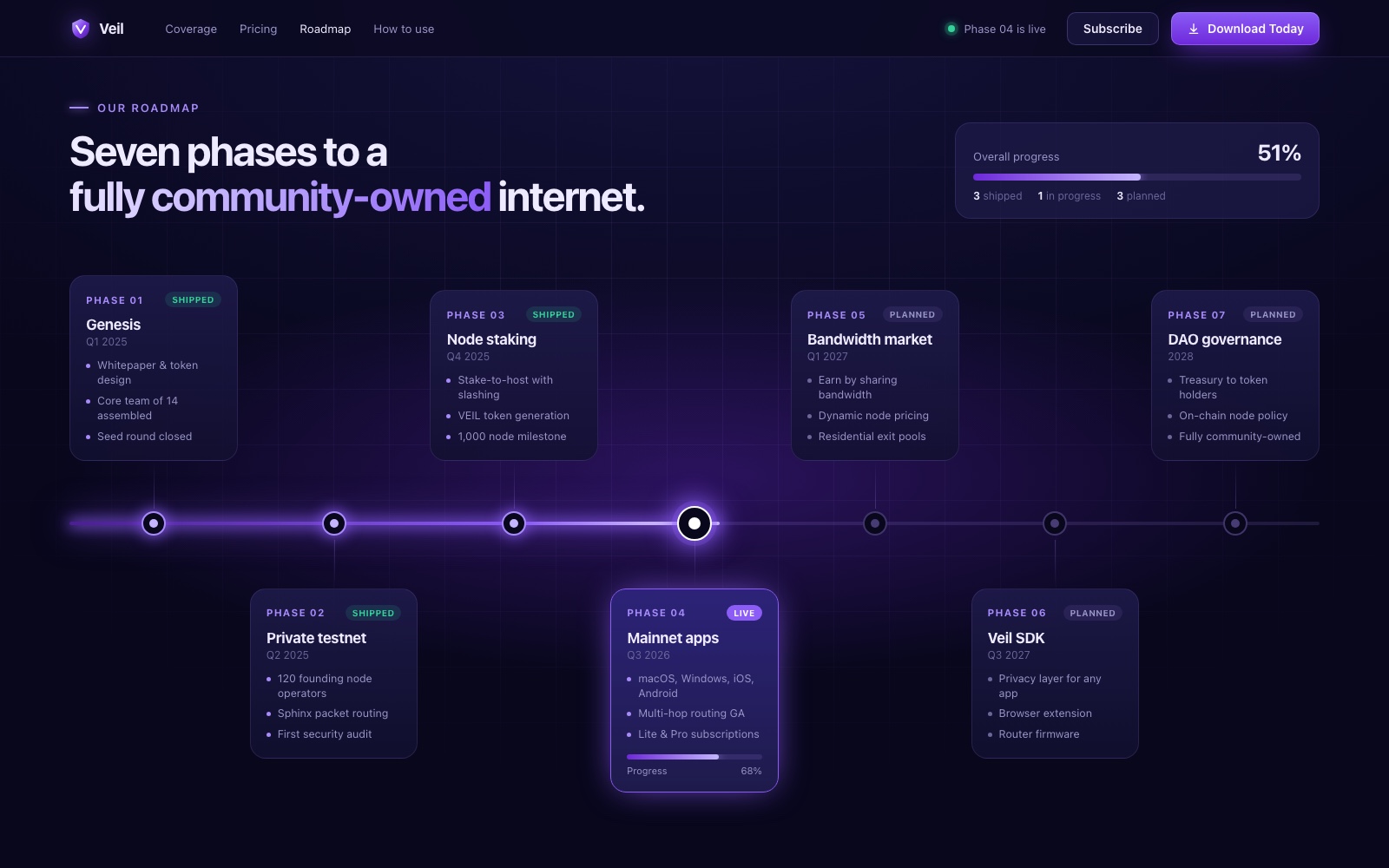
The "Our Roadmap" section is a linear, glowing timeline. Phase cards alternate above and below the line to keep each one readable, and colour-coded tags mark each phase as shipped, live or planned. The glow on the line stops at the live phase, so progress reads correctly before anyone opens a card. An overall progress panel sums up where the project stands for investors.
Mobile app: "How to Use"
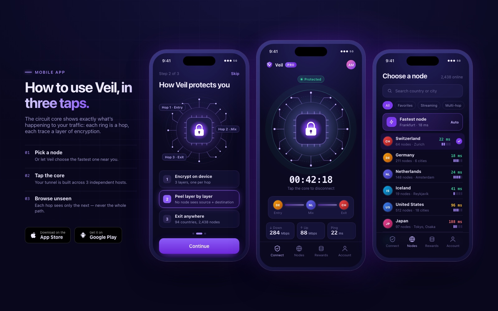
The mobile flow explains the product in three steps: pick a node, tap the core, browse unseen. Onboarding uses the circuit-core visual to show what happens to traffic, with each ring standing for one hop. The connected screen puts one large tap target in the centre, with the route and connection stats underneath. The server picker supports search, filters and a "fastest node" shortcut.
- Latency and load indicators on every country row help users choose without needing to understand the network.
- A bottom tab bar keeps connect, nodes, rewards and account one tap away.
Design system
Palette. The system rests on dark navy #1E1B4B as the base, royal purple #6D28D9 for primary actions and highlights, and accent violet #A78BFA for glows, headline emphasis and active states. Green appears only for states like "protected", "connected" and "shipped", so it always means safe or done.
Typography. Large, tightly set display headlines carry the brand voice, with a purple gradient on the key words. Body copy uses a clean sans-serif at comfortable reading sizes. Technical values such as IP addresses, timers and node IDs are set in a monospaced style, which signals precision and keeps numbers aligned.
Components. A shared library of translucent cards, pill status tags, segmented filters, stat cards with sparklines, country rows and paired buttons. The same patterns repeat across coverage, pricing and roadmap, so a long page feels like one product.
Motion and visual language. Glow is the main visual signal. It marks whatever is live, selected or recommended. The circuit core, the route lines on the map and the lit segment of the roadmap all use the same treatment, so users only have to learn one rule.
Responsive strategy. We designed every section for desktop and mobile together. The laptop and phone mockups share state and components, the mobile app reuses the landing page's visual vocabulary, and primary CTAs stay within easy reach on smaller screens.
Results
The design balances technical sophistication with ease of use. A clean, modern look and a clear information hierarchy make the site feel secure, and the short path from learning to downloading is built to encourage software adoption.
The system gives the product one consistent identity across web, desktop and mobile, which supports long-term brand authority in Web3 privacy. Beginners get a clear story and one obvious action, and enthusiasts and investors get the depth they want.